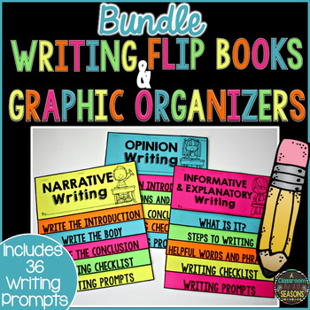
Week #1 of the TpT Seller Challenge has begun and the challenge is to make over a cover product. (I found directions on the blog Teach Create Motivate.) I have been been working on new covers for the last month or so and have had great results.
Who knew what a difference a new background and better fonts could make?!
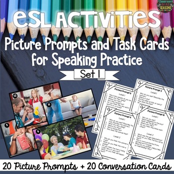
Here are some tips that have helped me with me with the cover above as well as others:
1. First, I changed my cover fonts, making my
titles much larger and bolder. (My
favorite fonts are
from www.kevinandamanda.) In
addition
to
changing the cover fonts, I also changed the titles
to what I thought
most people would be searching for. For example, the
main title in my old
cover page (see below) was “Writing Prompts” with “Narratives” written underneath and in
smaller type. Since this product will cater more to people searching for "Narrative Writing",
rather than "Writing Prompts", that should
be the title that people will see first, as in my new
cover.
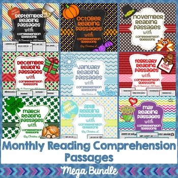
2. Although there is excellent free clip art, I
spent money in order to purchase some
great frames and backgrounds. Many sellers will tell you that you have
to spend money on clip
art to make great products and I don’t disagree.
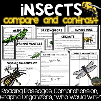
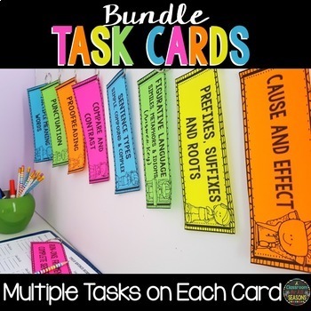
3. Third, I added actual pages from my product
to the cover page. I noticed that when
I am looking for a product myself, I usually just check out the ones
that have pages
from the product on the cover. It is one less step for me. If those pages look interesting,
your product and then “Insert pictures”
onto your cover page.)




Your product upgrade came out great! I agree that there is great clipart out there for free, but the purchased clipart seems to add even more :)
ReplyDeleteSara
Frampton's FUNdamentals
It really looks great! It really makes a difference.
ReplyDeleteoldschoolspeech.blogspot.com
Hi there! So glad to find you through the TPT Seller Challenge. Your updates look great! Like you, I've invested in some good fonts and clip art. They really add some pop to my products. See you at the next challenge!
ReplyDeleteAntoinette :)
Shoelaces and Sugar Cookies
Thank you so much for the tips! I love your new product cover. I, too, like to see images of actual pages on the front cover of a product! Nicely done!
ReplyDeleteI just stumbled upon your blog and I love it!! Especially the graphics in your title! Amazing! Well done on your Makeover Madness on the TpT Seller Challenge. It looks fabulous, truly great!
ReplyDeleteTeaching Autism